This is the third part of the Mobile Growth Series, which aims to help you take your app to the next level. In each episode, we will provide insights into topics related to data, product optimization, and growth strategy. Subscribe to our newsletter to stay updated about future episodes.
What you will learn in this article:
- How to maximize loading time with an effective Splash screen
- Which tricks to use in your Welcome screen to captivate new app users
- How to remove friction from the Sign-up process
Table of Contents
Mobile App Onboarding & the First-Time User Experience
Just like a new hire needs proper onboarding to succeed in their role, the same principle applies to the first-time user experience (FTUE) for mobile apps. If a user is thrown into an unfamiliar environment without guidance or explanation of key features and benefits, they are likely to become frustrated and potentially seek out a different app.
In other words, the FTUE in mobile app onboarding is critical to retaining users and driving conversions. It’s the equivalent of providing the necessary tools and materials to an employee to excel in their job, but for app users.
In this article, we’ll explore how to optimize the onboarding process for subscription apps and share psychological hacks to boost conversion rates.
The FTUE serves three operational functions that are essential for successfully introducing users to a mobile app:
- Educate: This involves clearly explaining what the app is all about, highlighting its main features, and conveying its unique selling points (USP) to potential users.
- Guide: The FTUE should also provide users with clear, step-by-step instructions for how to use the app, setting expectations for what they can expect and positioning the app as an expert in its field.
- Solve Formalities: Finally, the FTUE should handle any necessary formalities, such as obtaining privacy or permission rights from users and facilitating the account creation process
What might not be obvious is that the FTUE serves a critical strategic function beyond just getting users started with a mobile app:
- Show Value (as soon as possible): This means demonstrating the value that the app can provide to users by solving their problems or fulfilling their needs. Ideally, this value should be tangible to the user, such as through a personalized plan or a preview of the tool’s results.
A well-designed FTUE can have a significant impact on a mobile app’s activation, conversion to subscription, longevity, and long-term revenue. If executed correctly, the FTUE can be the first step in addressing the real challenge that subscription-based apps face: creating a strong user habit.
Throughout this article, we will guide you through how to optimize four key sections of the FTUE:
- Splash screen
- Welcome screen
- Sign-up screen
- Opt-in screen
We’ll also share some psychological tricks that can effectively hook users from the outset and examine how top mobile apps in the subscription app market use these hacks in their onboarding flow.
The Splash Screen: Use Loading Time Wisely
Typically, apps require a certain amount of time to process the provided information. This includes loading basic data so that the user can view content on the first screen. During this loading period, the user is presented with a launch screen, also known as a splash screen.
The splash screen is an image that appears while the app is loading. Typically, it displays a logo or image along with some basic information (as seen in the examples below).
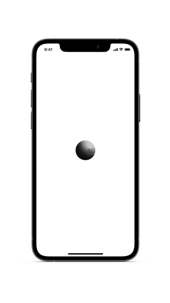
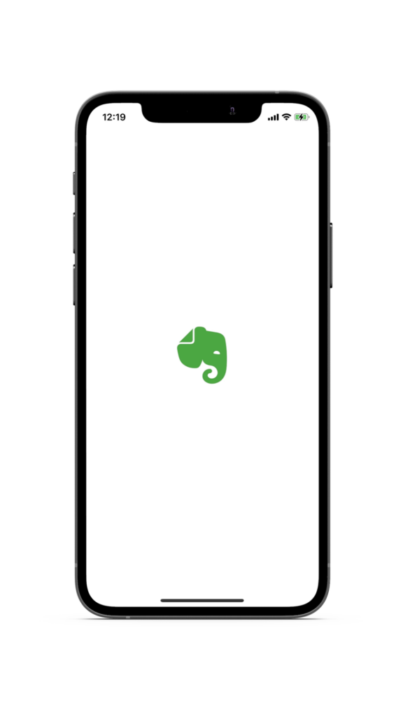
It seems that Co-Star (left), a personalized astrology app, and Evernote (right), a note-taking and task-management app, are missing out on opportunities to engage mobile users with their splash screens. Currently, both apps only display a white background with their logos.
In the following examples, we will explore how these mobile apps could make better use of their splash screens as part of the onboarding process and take advantage of some low-hanging fruit.
How Can You Make The Splash Screen More Interesting For Users?
Waiting for a mobile app to load can be an anxiety-inducing experience for users, but there are ways to make it more engaging and alleviate this frustration.
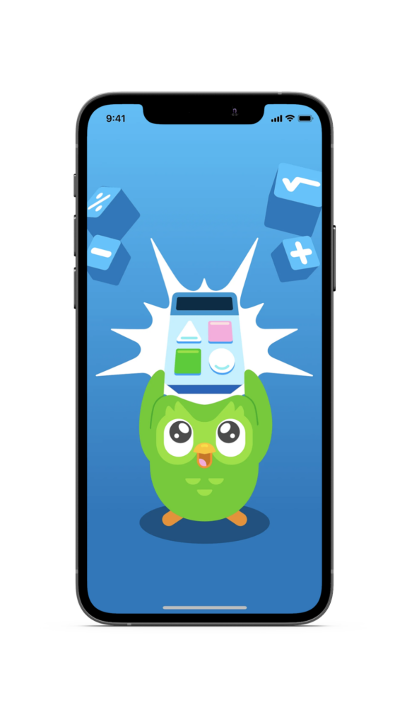
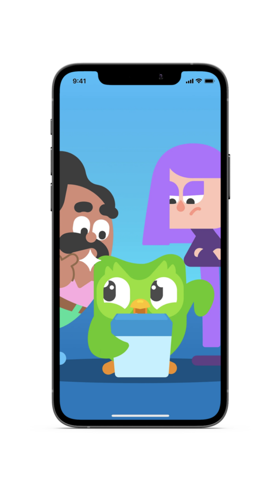
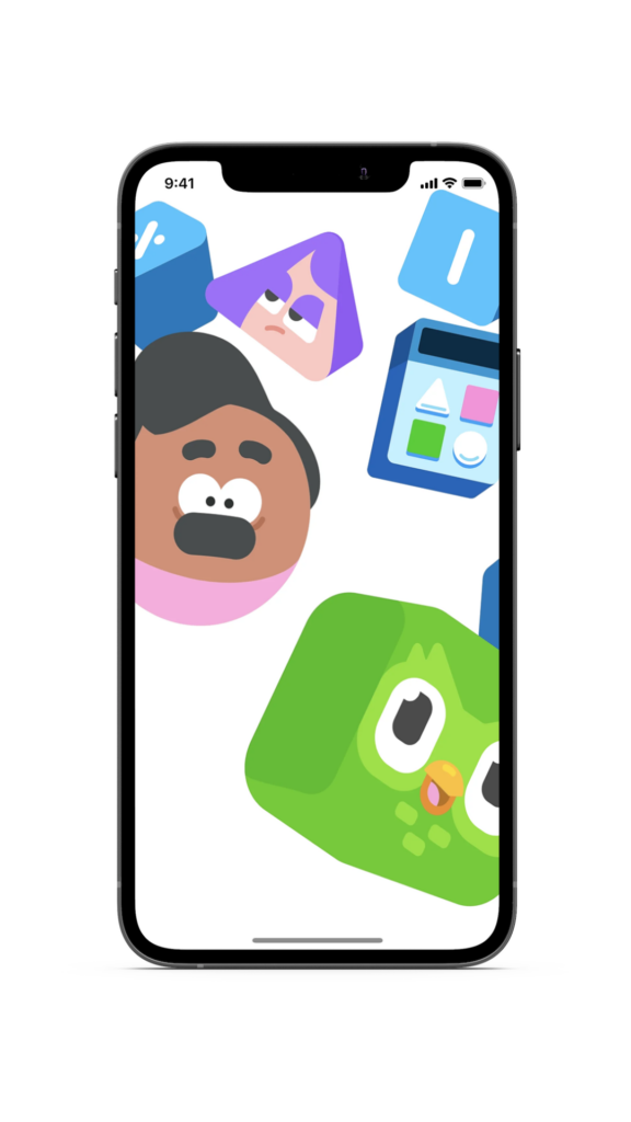
Rather than relying on a basic progress bar or loading icon, which provides almost no feedback, use the splash screen to add value for the user. Apps like Calm, Duolingo Math, and Breeze have already successfully implemented this strategy.
cALM
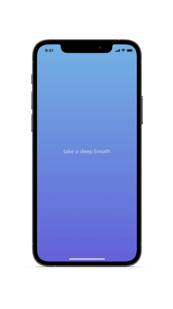
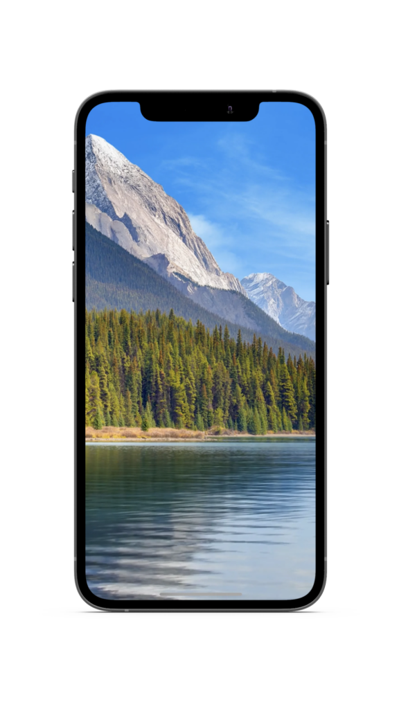
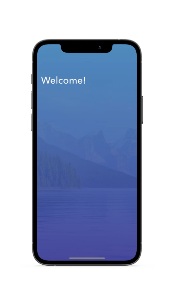
Calm, a top-rated mobile app for sleep and meditation, stands out from the crowd by offering users a unique and refreshing splash screen experience. Instead of the typical static image, Calm provides a simple breathing exercise that immediately engages the user.
This approach is a prime example of how a well-designed splash screen can make a powerful first impression and set the tone for a positive user experience.
Duolingo math
Duolingo Math is an education app designed to help users learn foundational math skills. Its splash screen leverages recognizable characters from the original Duolingo language learning app in a short but captivating video animation that immediately captures the user’s attention.
Breeze
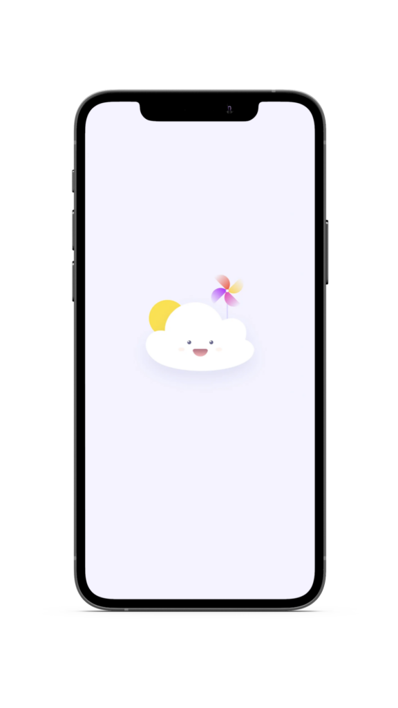
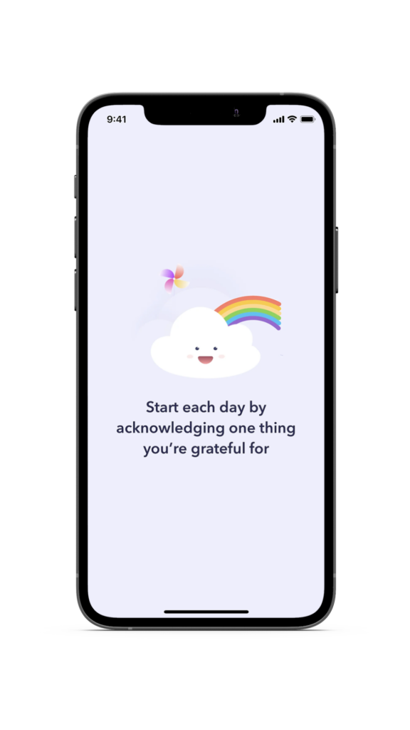
Breeze is a well-known mental health app that empowers users to improve their well-being. The app’s splash screen not only sets a positive tone for the user experience but also conveys the app’s key value proposition in a concise and accessible way.
The Welcome Screen: Hook New Users At First Sight
The welcome screen is a crucial component of almost every FTUE. While its design may vary depending on the app’s vertical, a well-designed welcome screen should include four core features:
- The app’s name or logo
- A unique selling proposition (USP)
- A sign-up or login button (where applicable)
- A background or top image
In the following sections, we’ll explore some examples of visually stunning welcome screens and highlight design considerations to keep in mind when creating your own.
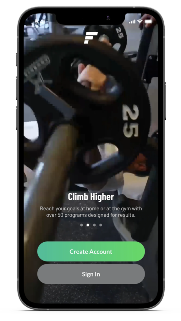
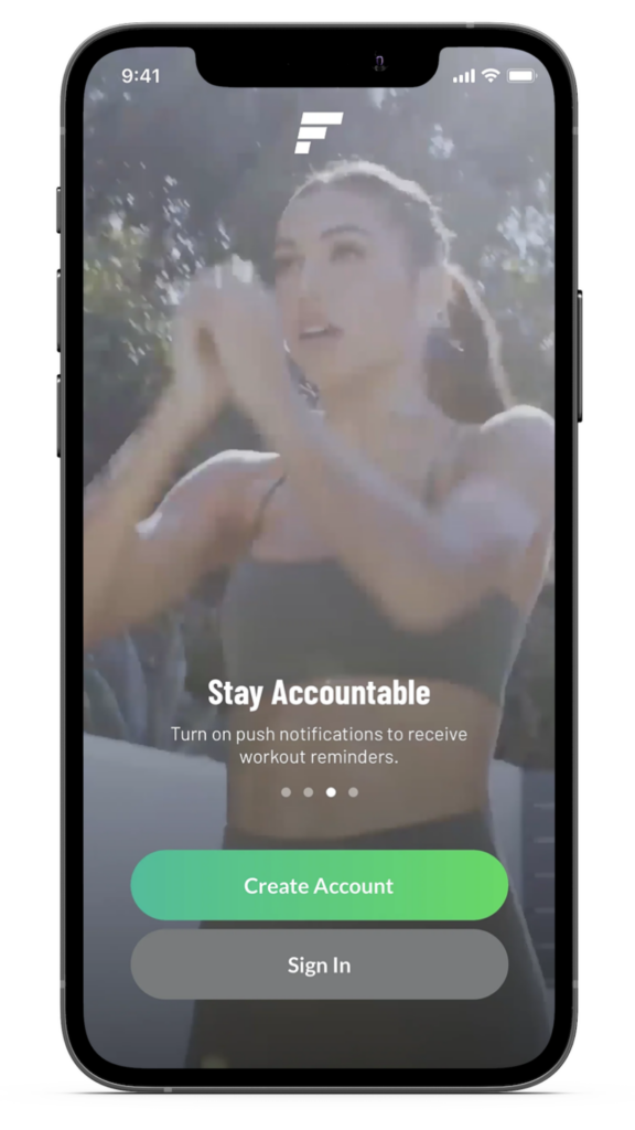
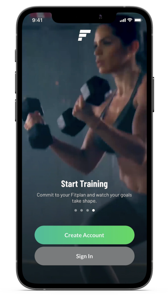
Fitplan
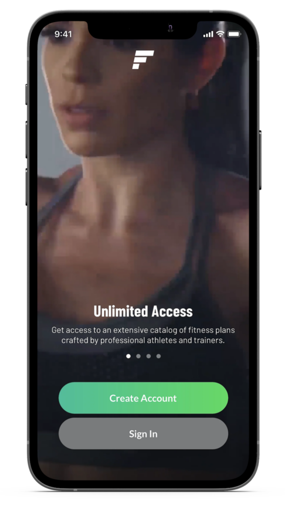
The training app Fitplan incorporates all of the essential elements into its welcome screen. The logo is prominently displayed at the top, which increases brand recognition and catches the user’s attention.
What to consider: When creating a logo for your app, it’s important to consider whether it should be compact or extended.
The unique selling proposition (USP) is the main element that stands out alongside the call-to-action (CTA).
What to consider: Finding a balance between readability and information is crucial, and ensuring visibility is also essential. A typical approach is to use a title and subtitle to explain the app’s main benefits clearly.
The sign-up/login buttons have a clear CTA that highlights what the user should do next.
What to consider: Depending on your app’s user base, the sign-in button may be more or less relevant. For example, it can help to reduce the size of a sign-in button for new apps with a limited user base.
Background images provide a clear visual reference and leverage the priming effect to attract users.
What to consider: It’s essential to consider whether a static or video background makes more sense for your app. It’s worth testing which option resonates best with your target audience.
💡 What is the Priming Effect?
Priming is when the previous object (prime) with which the interaction took place changes the further behavior of a person (creates a priming effect).
It refers to activating particular representations or associations in memory. Using a video of a fit woman training, for example, let the viewer associates himself (subconsciously) with the person in the picture (she is doing it, I’m doing it), which creates extra motivation. 💪
Fitplan has taken its welcome screen a step further by adding a slider element. The slider is a versatile UI component used to showcase additional benefits or tell a story. The slider serves as a perfect example of the Chunking Effect, which makes the information more digestible for the user.
What to consider: When creating a slider, it is crucial to focus on the benefits (vs the features) of the app and use it only if you have something valuable to say. A good technique is to make it unskippable by incorporating a “Next” button to ensure that the user is exposed to all the messages.
💡 What is the Chunking Effect?
In cognitive psychology, chunking is a process by which individual pieces of an information set are bound together into a meaningful whole. Fitplan, in this case, is providing a preview of what’s going to happen and how it will guide the user to their first training and beyond to complete their fitness goals.
Blinkist
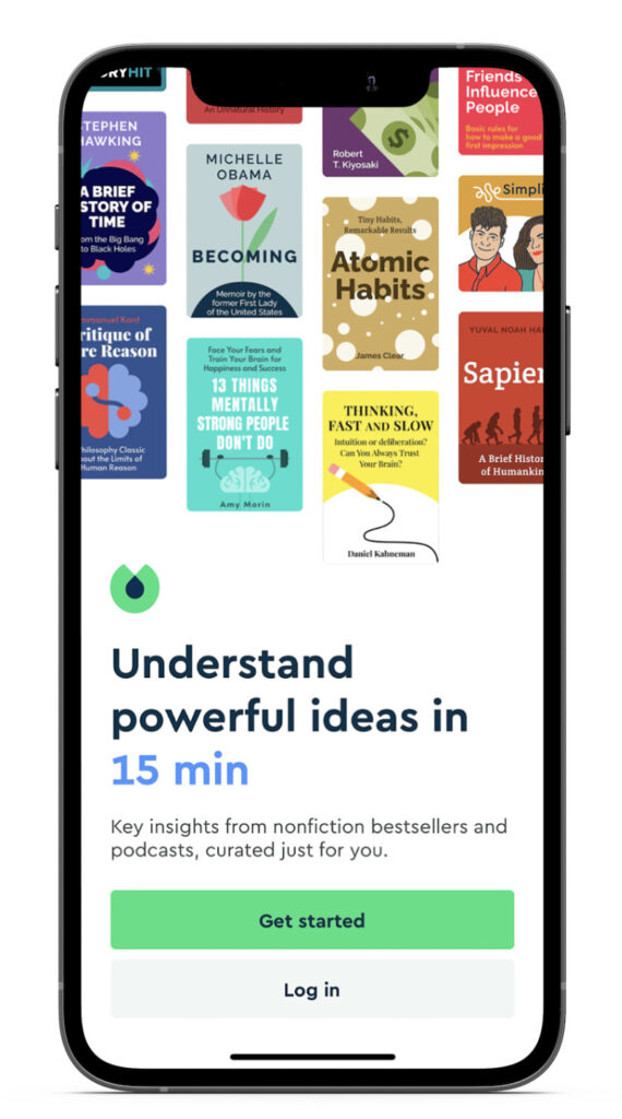
Blinklist, a popular mobile app that provides book summaries, is designed for busy individuals who want to improve themselves without investing time into reading full-length books. Some noteworthy elements of its welcome screen include:
The top image captures the initial attention as the first element of the page.
What to consider: Users tend to consume content from top to bottom, so place elements accordingly and include easily recognizable elements (e.g. mainstream books).
A strong USP captures attention!
What to consider: Use copy and formatting wisely, and make your promise or benefit tangible (e.g., offering key insights in just 15 minutes of listening). If possible, include personalized elements (e.g., “Curated just for you: Key insights…”).
The Sign-up Screen: Eliminate Friction And Keep It Simple
Typically, sign-up screens are the part of the FTUE with the highest churn rate. This is not a surprise, as users need to share personal information (e.g., name, email, telephone number) complete several steps, and invest their time and interest. Therefore, it is crucial to demonstrate to users beforehand that the app is worth their effort (the Reciprocity Effect). By using the Reciprocity Effect in design, you can give the user something valuable before asking for anything in return, which helps build a sense of commitment and trust.
💡 What is the Reciprocity Effect?
In social psychology, reciprocity involves responding positively to a positive action. In design, it means offering the user something of value for free before asking them to take any action. During the onboarding process, users are the most committed, which is known as the “day-zero opportunity“.
Therefore, providing users with something valuable during this time can help to establish a stronger commitment from the user.
Here are a few tips on how to make your sign-up flow smooth and frictionless:
1. Utilize a Skippable sign-up Screen
The Hotels.com and Any Distance apps have implemented a clever solution to reduce friction during the sign-up process. Users can click on the Get Started or Skip buttons and explore the app before committing to creating an account and sharing personal information.
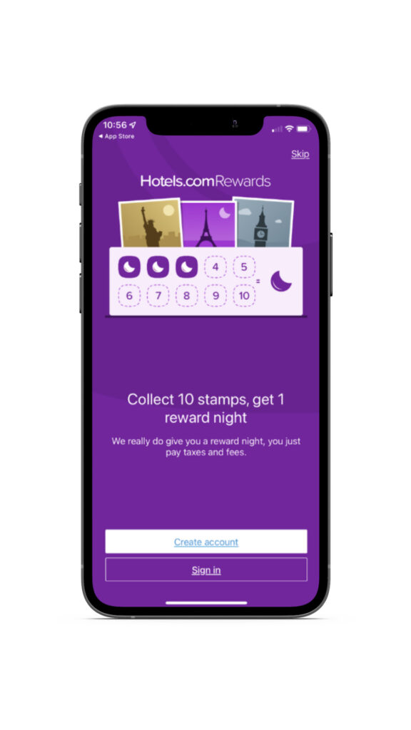
While this approach may not be possible for apps with stricter sign-up requirements, it is always an option worth considering and testing for apps that can implement it.
2. Give The User More Options For Registration
Offering users multiple options for registration can increase their ability to complete the sign-up process. Nowadays, it’s common practice to allow users to register with one click through existing accounts on Facebook, Google, etc. This way, they don’t have to go through the hassle of creating a new account.
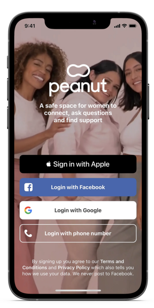
Peanut is a mobile app for women to find support and connect with one another. The app offers four different ways to sign into the app (Apple, Facebook, Google, and Phone Number).
What to consider: When considering the number of login options to provide, it’s important to evaluate the actual usage of each option and consider reducing the number of CTAs to simplify the choice for the user and reduce maintenance costs.
3. Simplify the Registration Process with a “Magic link”.
A great way to streamline the registration process and reduce user distraction is by using a “magic link”.
💡 What is a Magic Link?
Magic links enable users to sign in to a mobile app without entering a password. Users receive a URL with a special token via email or SMS, and when they click on the link and authenticate themselves, they are automatically logged in and redirected back to the app or system. It’s like having a magical password, but without having to actually enter one.
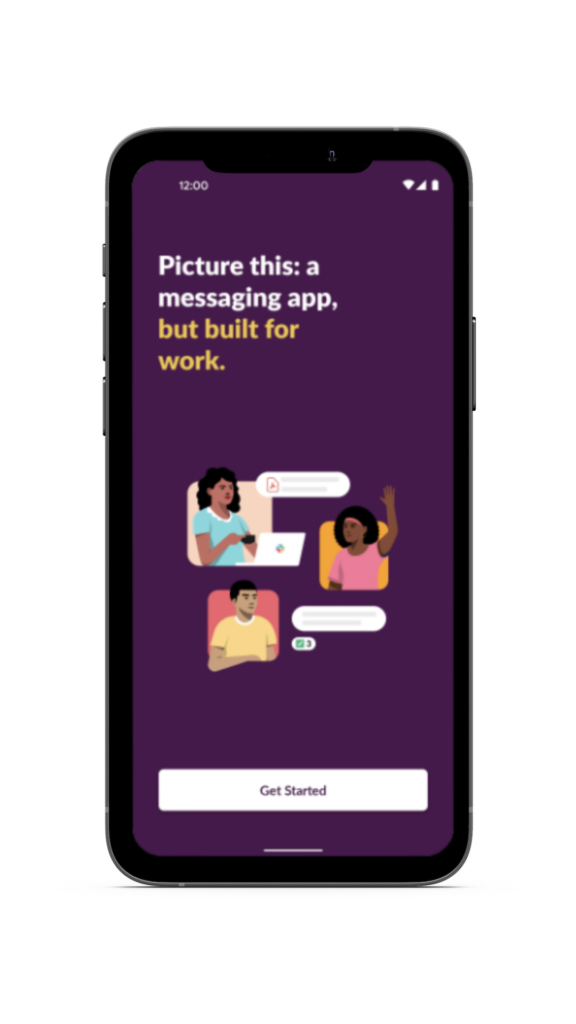
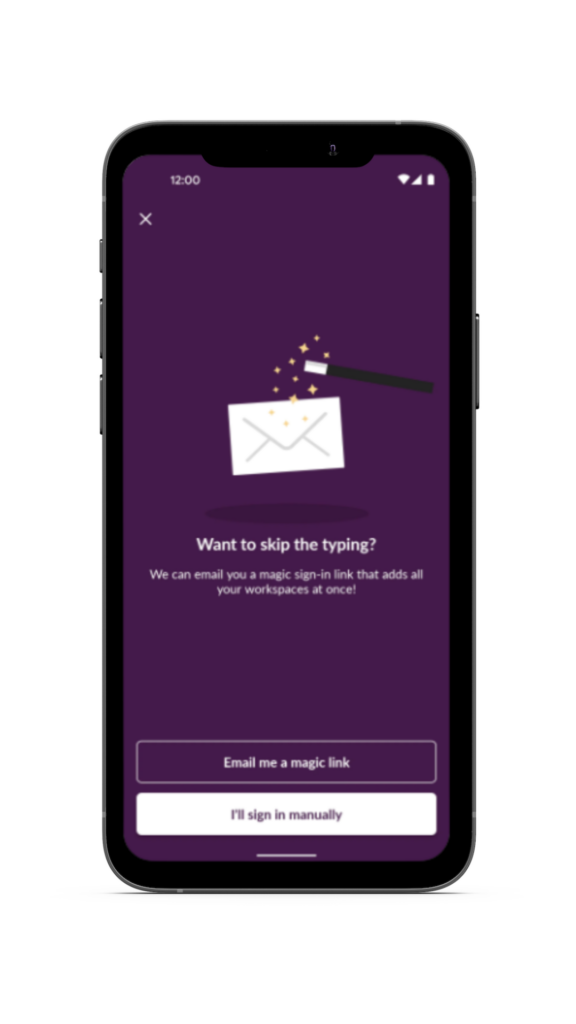
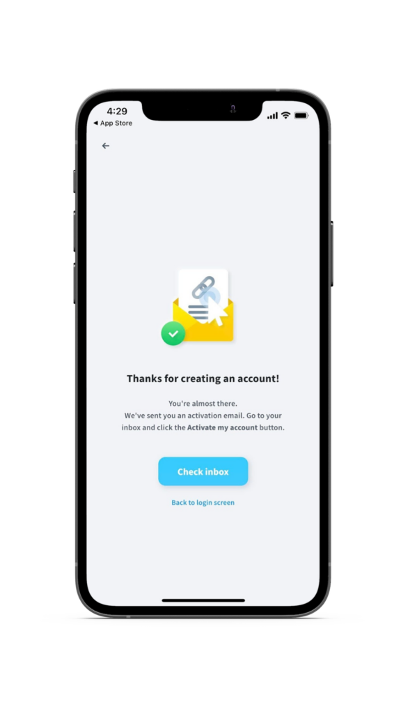
While subscription-based apps don’t often use it, offering both traditional registration methods (manual sign-in or using a magic link) is an excellent solution to simplify the registration process.
Slack and GetResponse are great examples of this approach. By providing users with different options for registration, you can increase their ability to complete the intended action, which is to sign up for your app.
The Opt-in Screen: Pre-condition User Psych
Opt-in screens are critical in ensuring compliance with regulations before sending users any form of communication, whether it’s notifications, emails, or other types. Some opt-in screens may also ask users to agree to specific terms and conditions or provide personal information.
To increase the opt-in rate for your subscription app, timing (when to ask) and manner (how to ask) are key factors to consider. Just like proposing on a first date, asking for opt-in notifications right after opening the app may not yield the desired response. It’s crucial to engage and reward users first, demonstrating the value of the app, before asking for access to their personal information.
A common technique to improve the opt-in ratio is to create a pre-prompt screen just before the opt-in request. This primes users during the FTUE to say yes and gives you more creative freedom to persuade them using copy and design.
Additionally, to build trust, it’s essential to explain why you’re asking for permission and provide a compelling, data-backed reason for opting in.
Let’s see a few examples of effective pre-prompts used in the onboarding process:
Moonly
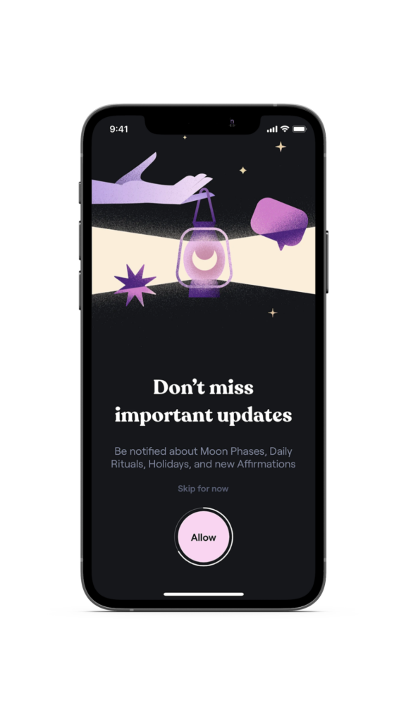
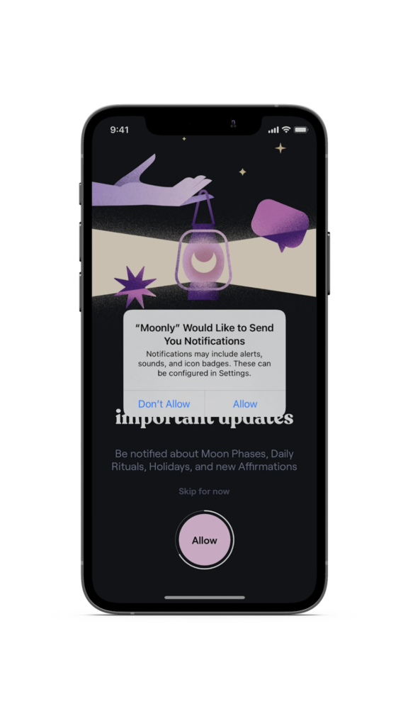
Moonly, a mobile app that provides daily motivation based on moon cycles, has effectively used the pre-prompt technique to increase opt-in rates.
Their pre-prompt message, Don’t miss important updates, creates a sense of urgency and taps into the Loss Aversion Effect. This sets the stage for the official Apple prompt, making users more likely to opt-in. Simple but effective.
💡 What is the loss aversion effect?
The Loss Aversion Effect is a psychological phenomenon where people tend to value potential losses more than gains. To illustrate, losing $100 creates a stronger feeling of dissatisfaction than gaining $100 brings happiness.
By tapping into this effect, Moonly’s pre-prompt message “Don’t miss important updates” creates a sense of FOMO (Fear Of Missing Out) for the user, playing on their potential loss of valuable information. This clever use of copy effectively activates the Loss Aversion Effect.
Hopper
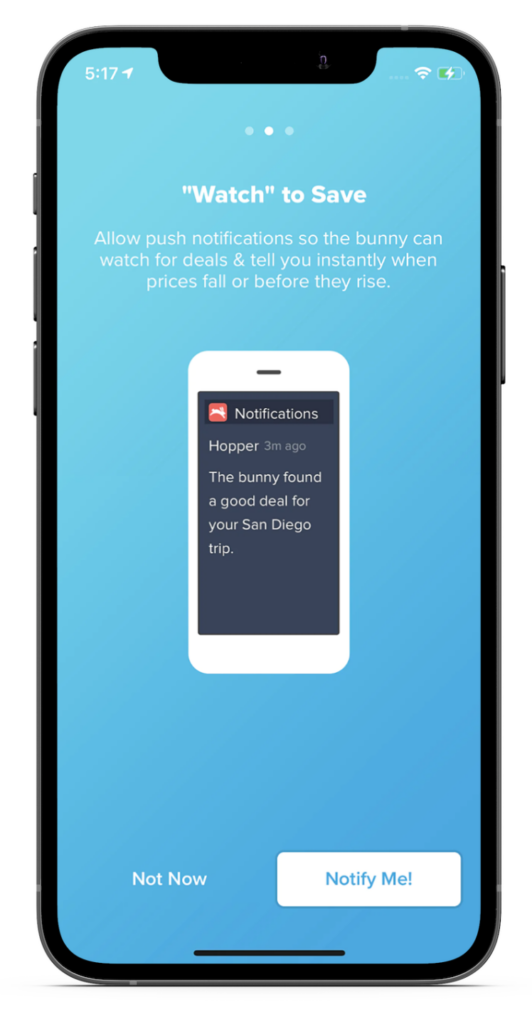
Hopper, a travel app that assists users in searching for flights and hotels at the best prices, employs a clever strategy to encourage users to opt-in for notifications.
By notifying users when prices drop, they can snag a real deal and book a more affordable room or flight. The app leverages the Loss Aversion Effect by using the copy “before they rise” in relation to prices. Moreover, Hopper provides a preview image of the notification, which gives users clear information to make an informed decision. This approach is crucial as people tend to stick with what they already know if the information is ambiguous, as demonstrated by the Ambiguity Effect).
💡 What is the ambiguity effect?
The Ambiguity Effect a cognitive bias where decision-making is affected by a lack of information or “ambiguity”. When the user is afraid of the unknown, they will likely bet on the safest choice. Especially in the FTUE and the pre-prompt, it is critical to explain WHAT the user should expect by giving this permission, HOW this will improve the mobile app experience (what benefits the user will get), and WHY you are asking to opt-in.
Headspace & Fastic
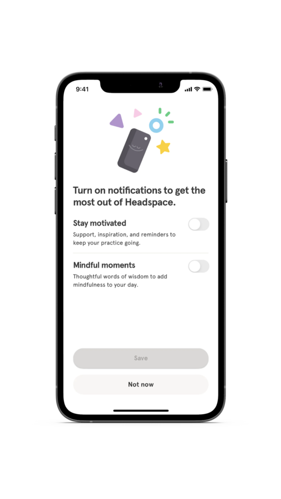
Headspace, a top meditation app, offers users a personalized opt-in screen with two notification options that empower them and make the benefits clear.
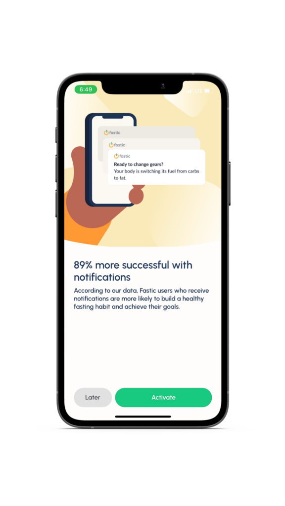
Meanwhile, Fastic, a leading intermittent fasting app in the fitness category, provides data-backed evidence that notifications lead to an 89% increase in success and a better overall app experience.
It’s important to note that both apps, as well as Hopper (mentioned previously), give users the option to skip push notification acceptance (“Not now”). However, showing the value of accepting notifications is crucial for increasing opt-in rates during the onboarding process.
Closing Remarks
We hope that this article has provided you with valuable insights on how to optimize four critical areas of the FTUE process, including the splash screen, welcome screen, sign-up screen, and opt-in screen. By implementing the recommended strategies and leveraging psychological hacks, you can improve the onboarding process and increase your conversion rate from installs to subscriptions.
We are confident that our suggestions will help you achieve your business goals and encourage you to review our additional tactical recommendations for optimizing the conversion rate. It’s crucial to focus on this metric as it plays a significant role in the success of your subscription-based app.
What role does the ftue play in the mobile app onboarding process?
Creating a well-designed first-time user experience (FTUE) for a mobile app can greatly influence its activation, subscription conversion, longevity, and long-term revenue. When executed correctly, the FTUE can serve as the initial step in addressing the main challenge that subscription-based apps encounter, which is establishing a strong user habit.
What are four key features of the mobile app onboarding process?
- The splash screen
- The welcome screen
- The sign-up screen
- The opt-in screen
